Are you feeling slightly unconventional?
Then you are right on-trend with the Pantone Color of The Year – Viva Magenta.
Pantone Color Institute, the consulting service that forecasts global color trends, calls it an “unconventional shade for an unconventional time.” It’s all about your self-expression.
Since the turn of this millennia, the new Pantone Color of the Year has been met with much anticipation. The design world, fashion icons, top consumer products companies, plus the person who just has to be in the know all eagerly await Pantone’s annual December announcement of the quintessential color for the year to come. This year, December 1, 2022, was the day of excitement, and Viva Magenta was revealed.
You can already find a slew of products either in the exact color or color family, including simple things like key chains and notebooks directly from Pantone. They worked with trusted corporate collaboration partners so new products would be ready the same time as the color was launched. Motorola is offering one of its high-end smart phones in the color that is “rooted in the primordial.” Cariuma, a footwear brand focusing on skate shoes, has launched six styles of sneakers all proudly sporting Viva Magenta.
Numerous home décor companies have joined in, with everything from pillows to paint colors to molded acrylic chairs that are in the Magentaverse. These companies were already on the path, with the current design trend of Barbiecore, a decorating style that uses both pastels and bright pinks. Barbiecore is revamping homescapes with the color palette that promises to be everywhere in 2023.
A quick primer on Pantone Matching System
That’s great for companies who thrive on giving consumers the newest of the new, you may think. But what does that really have to do with my business?
Quite a lot, actually.
If your company has ever gone to print anything — a brochure, your logo on a polo shirt, even your letterhead — someone has likely asked you what your PMS color is. That’s because since 1963, the Pantone Matching System has been the global standard for color matching, allowing any supplier anywhere in the world to accurately reproduce your brand color. The color of your brand is an asset, and just as important as the logo itself.
Designers will often talk about PMS color chips, and most art directors have a Pantone Formula Guide, a color matching tool that looks like a paint company’s fan deck, with more than 2300 spot colors. The system was created to give you consistency in your company’s look and branding across 4-color printing, screen and promotional printing, and now even into the digital realm.
Your brand color reflects your company and is part of your corporate image. It signals that your business will be around for the long haul. You do not want to change your brand color or your corporate materials every year.
At the other end of the spectrum, Viva Magenta was created as a consumer trend forecast. The folks at Pantone have searched popular culture from art and film and fashion to technology and sports. Each aspect of our lifestyle has been scrutinized, and this year, Pantone decided we needed a color that “galvanizes our spirit, helping us to build our inner strength.”
In this tech-heavy world, Viva Magenta “invokes the forces of nature,” with the red family being an intense dye color that humans have used since the start of civilization. The color gurus think it is time to get out of our shell, describing their new-chosen color as joyous, optimistic, a little rebellious, and inclusive of all.
Pantone just did all the market research for you. Whether you are a fan of the color or not, Viva Magenta is it. It “merges the warmth of the natural world with the endless, rich possibilities of the digital space,” said Elley Cheng, Pantone’s vice president and general manager.
Between natural and digital – we all live there somewhere.
Where can the Color of the Year Work for You?
You can use Viva Magenta as the background color for getting your message out. Normally you look for a background color that coordinates, but here the whole purpose is for the on-trend color to stand out even in the business world.
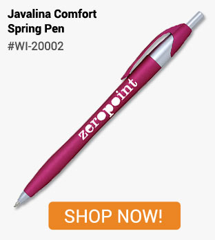
A calendar could be the perfect place to start. More than 60% of consumers own a promotional calendar, and keep it for a year or more. Just enough time to reveal next year’s trend color. You can never have enough pens. At least you can never find your favorite one. Give your customers or employees a pen in a color that is hard to miss. Custom Pens are one of the least expensive promotional items, but are still kept for an average of 9 months.
Other desk accessories also stay in use for just more than a year. Try a set of sticky notes in their own colorful holder. Portfolios are a great business gift item, especially this year where color represents a merging of the digital world with humanity. More than half of consumers use their promotional desk accessories weekly or more often – your business branding will be seen more than 1,450 times.
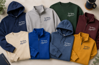
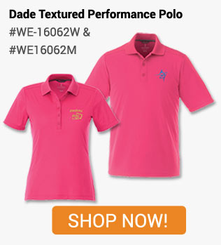
One of the easiest places to use Viva Magenta is in apparel. People keep and wear both polo and t-shirts because they have attractive design and are made of quality material. A new t-shirt for this year’s group outing could be just the right place for the color of the year. While the red-pink hue may often be though of as more of a feminine color, work crews use brightly colored shirts for easy identification and visibility on the job-site. There is no overlooking Viva Magenta. Plus performance wear and polo shirts rank in the Top 5 most influential promotional products. Your customers’ will remember the apparel came from you.
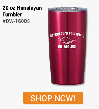
Drinkware remains a popular choice in promotional items, especially for for Gen X and Baby Boomers. Regionally, it is preferred by those in the Southeast, Midwest and Pacific areas. Drinkware generates 1,400 impressions during its lifetime. And with Viva Magenta on your side, you will make quite the impression!
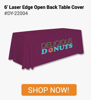
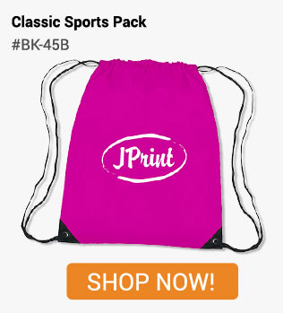
Events are always a great way to get your name out. Curating the right attendee list and getting the word out can be a challenge, but once people commit, 90% show up to a paid event. Here you can use the Color of the Year to scream your branding – a table covering all in Viva Magenta will certainly draw attention. Keep it more subtle with a colored lanyard and printing on name badges. Everyone needs a tote to carry their event swag and at-home business materials, and attendees will remember your event all year long. Quality imprinted bags are used by nearly 3/4 of consumers and are kept an average of 11 months.
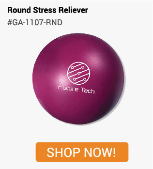
If all of this is just too much for you, let MARCO Promos provide some stress relief. Gadgets that pop, quish, talk or spin will help you let it all out. Or proudly declare your role in the Magentaverse with a badge ribbon which states simply “STRESSED.”
Don’t stress too much. Just 12 more months and we will have a new Color of the Year. But don’t wait that long to let MARCO Promos help your business live brightly. Call or email us today.
SOURCES
2023 Color of the Year, Pantone Institute, December 1, 2022
The Pantone 2023 Color of the Year is bold and very ‘90s, The Spokesman-Review, December 10, 2022
Global Ad Impressions Study, 2019 Edition, Advertising Specialty Institute
Global Ad Impressions Study, 2020 Edition, Advertising Specialty Institute
Global Ad Impressions Study, 2022 Edition, Advertising Specialty Institute
How to Mitigate Event No Shows, Jessie Fetterling, October 21, 2015